Alright folks let’s here it…which one do you like best?
First SOOC

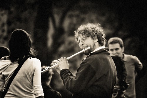
Kelby 7 Point System (hereto known as K7PS)

B&W Noise Added
Whole Can-O-Photoshop

Alright folks let’s here it…which one do you like best?
First SOOC
Kelby 7 Point System (hereto known as K7PS)
B&W Noise Added
Whole Can-O-Photoshop
I vote for K7PS here.
I too like the K7PS and the way the colors just bring it all to life… and for the life of me, I can’t understand why they didn’t call THAT instrument the “tube-ahh” and the tube has the big “fluted” bell….
Kinda like parking in a driveway and driving on the parkway… bass ackwards this language is…
Also the K7PS. It brought out some nice, rich tones in the colors.
Really? And here I was thinking it looked better in the B&W version.
Yes, K7PS. The B&W is pretty cool though too. I bet either would look cool cropped a bit…maybe vertically with the flute dude’s torso in the bottom right corner and the tree giving some space towards the upper left?
But the whole can-o-photoshop? You crazy, Girl.
The b&w is nice, but for me at least, music means color.
Yeah. The B&W is nice but I like the Kelby 7-point version best. Depending on how you would use it, the Whole Can-O-Photoshop is very cool. I like how it isolates the musician.
I like the drama of the B&W and the zaniness of Whole Can O PS. However, I think that technique is better applied with a cooler instrument, like the sax or trumpet.
The K7PS is very noice. Very noice indeed.
Hey, Tojo! waves at Tojo.
Hey, Renae! waves at Renae. Not that I don’t wave at Tojo too. Renae has been blog MIA for awhile now.
I’m a-jumpin’ on the 7-point bandwagon.
I am for somewhere between K7 and SOOC, actually. I like how the K7 made the flutist really pop, and I like what it did for the girl’s hair and the guy’s blue shirt in the background. But for some reason, I think that guy in the back got too red. And the girl’s shirt looks more … transparent. (Which Tojo may not mind.)
I think I like the SOOC background because it looks more like impressionistic art, which, for me, adds to the whole Paris feel to it. So I guess what I’m saying is that I vote for K7-ing the flutist, and slightly K7-ing (so they don’t overpower the flutist) the girl’s hair and the blue shirt. Then maybe add just the slightest vignette.
But that’s just me. Don’t pay me no mind. I’m also the one who orders salad dressing on the side and asks about substitutions at restaurants.
No…this is all really good. The reason the Whole Can-O-Photoshop is there because I found blueshirt and the chick destracting…When I tried to crop them out the photo lacked drama and was to my taste too tight on the flutist. I liked the rosey tones to his skin so the B&W wan not doing it for me…but IvoryHut…I think your suggestions are right on.
Although…and I should look at them all together…the accordian guy with grimace, the granny with tude, the dog walker and this guy all in B&W might make a nice exibit…hmmmm

Leave a comment